

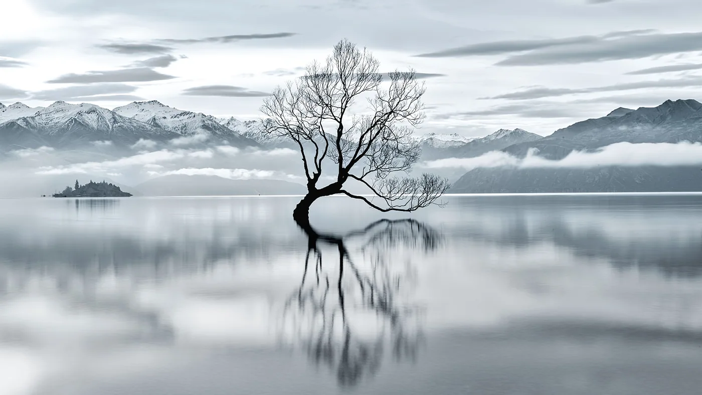
Contrast is one of the most powerful tools in a photographer's arsenal. It transforms ordinary scenes into compelling, memorable images that demand a viewer's attention. Whether you are working with light and shadow, color and tone, or scale and subject matter, contrast creates the visual tension that makes fine art photography resonate.
When you think of contrast in photography, your mind likely goes to black and white images with deep shadows and brilliant highlights. That is one dimension of the conversation, but contrast operates at every level of composition and vision. It is the difference between what draws the eye and what fades away. It is what makes an image feel alive.
The Power of Light and Shadow
The most visceral form of contrast comes from the interplay of light and shadow. Your camera captures the world as it reflects light, and the range between the brightest and darkest areas of an image determines how much visual punch it carries.
Consider a landscape where a mountain emerges from deep shadow into brilliant sunlight. The boundary between those zones creates drama. The viewer's eye travels along that line. The dark areas recede, making the lit portions feel almost three-dimensional, as if they are lifting off the frame.
To maximize light and shadow contrast, you can:
- Shoot during golden hour or blue hour when the sun is low and creates longer, more defined shadows
- Position your subject so that light and dark areas occupy significant portions of the frame
- Use foreground and background elements to create layers of tone
- Look for backlighting that creates rim light around your subject, separating it from the background
This principle works whether you are photographing a redwood forest, a waterfall, or an architectural detail. The goal is to make the viewer feel the weight of darkness and the warmth of light.
Black and White Contrast Techniques
Removing color forces you to rely entirely on tone to build visual interest. This is why black and white contrast techniques have remained central to fine art photography for over a century.
Black and white photography strips away the distraction of hue and asks a simpler question: what is the essential structure of this scene? When color is gone, contrast becomes the primary carrier of emotion and meaning.
To strengthen black and white contrast:
- Seek scenes with inherent tonal separation (bright skies against dark landscapes, for example)
- Avoid middle grays that feel muddy or flat. Push blacks deeper and whites brighter
- Use the full range of the tonal scale, from pure black to pure white, with all the grays between
- Compose so that the lightest and darkest elements anchor the frame at opposite corners or sides
When you examine work like landscape photography in the slow lane, you see how deliberate tonal choices transform a scene. The photographer has spent time with the landscape, waiting for conditions that reveal the structure beneath the surface.
Building Contrast Through Composition
Contrast is not only about tone. It lives in the relationship between elements within the frame. A large object next to a small one. A sharp detail beside a soft blur. A horizontal line meeting a vertical. A solitary tree in an open field.
This compositional contrast creates visual rhythm and guides the viewer through the image. It tells a story of scale, isolation, connection, or conflict.
When you place a small human figure against a vast mountain, you are creating contrast through scale. That tiny figure makes the landscape feel immense. When you frame a still lake beside a windswept tree, you contrast stillness with movement, creating tension and interest.
Think about how objects relate to their surroundings. A bright subject against a dark background reads as figure. A dark subject against bright background also reads as figure, but with a different emotional weight. This is the essence of contrast as a compositional tool.
Color Contrast and Mood
While black and white contrast is stark and direct, color contrast operates more subtly. A warm tone next to a cool tone creates visual vibration. Saturated colors next to desaturated ones create emphasis.
Natural landscapes offer rich opportunities for color contrast. The orange light of sunrise against blue shadow. The warm sand of a desert against cool rock formations. The green of vegetation emerging from charred earth after fire.
The key is intention. Notice where colors naturally sit in opposition in your scene. A photographer working with minimalist approaches might remove all but one dominant color to strengthen the contrast between that color and the neutral tones surrounding it.
Achieving Balance Without Crushing Detail
One common mistake is pushing contrast so hard that you lose the subtle information in shadows and highlights. The goal is not to create a graphic poster, but to reveal the structure and emotion of the scene.
In digital processing, you have tools to control contrast without simply crushing blacks or blowing out whites. You can increase contrast in one tonal range while protecting another. You can add local contrast, which emphasizes edges and texture, or global contrast, which affects the overall tonal range.
The best approach is to let your subject guide the amount of contrast you pursue. A misty forest might benefit from subtle, soft contrast. A dramatic rock formation might sing with bold separation between light and dark. A city street at night might demand high contrast to emphasize the geometry of buildings and the play of artificial light.
Viewing Contrast at Home and in Your Space
When you live with fine art photography, contrast becomes part of your daily experience. An image with strong contrast creates a focal point in a room. It anchors the space and draws your eye first.
This is why collectors often seek out photographs with intentional contrast. These pieces command attention without demanding confrontation. They invite you in, then reveal layers of detail and meaning the longer you sit with them.
When selecting fine art prints for your home or workspace, consider how the contrast in each image will interact with the light and colors of your space. A high-contrast black and white print might feel striking on a light wall. A subtly graded landscape might feel more meditative in a quieter corner.
Start Seeing Contrast Everywhere
The skill of seeing contrast comes with practice. Walk through your environment and ask where light meets shadow, where colors sit in opposition, where scale creates drama. Notice how these elements work together to move your eye and stir emotion.
When you understand contrast, you begin to see the world differently. You notice the rim light on a leaf. The way a cliff face catches the afternoon sun. The weight of darkness in a forest. These observations become the building blocks of compelling imagery.
Whether you are behind the camera or living with fine art photography on your walls, contrast is the tool that turns observation into experience. It is what transforms a moment into something that feels timeful and true.